Reminder: this is strictly my opinion. Your Substack is your creative adventure. Do it your way.
It’s easy to forget that your Welcome Page is seen by everyone who searches Substack and finds you. It’s easy because we authors seldom see it and it’s not even easy to find if you decide to look for it. I like to think of it as something like a movie trailer.
Here’s an easy way to find it:
yourSubstackurl/welcome … example: gratitudemojo.substack.com/welcome
This IMHO goes to
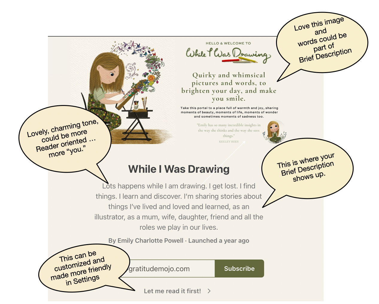
and her delightful Substack “While I was drawing.” Perhaps because I started my career in accounting, I fell in love with this graphic, which so captures my split brain years:When I saw this photo, I immediately wanted to rent a room in her brain.
Emily generously offers illustrations to her paid subscribers and has a delightful tone and look. However, this is IMHO, so I obviously have suggestions about her Welcome Page shown here with comments:
So, that’s all for now. More ideas, examples and IMHOs in the Substack Field Guides.


Thanks so much for your lovely words Joyce! Such a nice surprise - I’ll give some thought to your recommendations, they make a lot of sense 💛