


ENTER: Newsletter graphics are more than make-up for the page
Graphics and design help deliver your message

News … letter … the name itself indicates the primacy of words where images are demoted to a lesser role … just a part of “branding” or somewhat like lipstick for the page.
Even Sinch Mailjet in its positive sounding article titled “Effectively use newsletter graphics with these 6 tips” combines that title with a subtitle that highlights the “lesserness” of images … “Without graphics, newsletters just look as dull as legal documents. Add some pizzazz to your newsletter design with this selection of graphical elements.”
Graphics do add pizzazz; however, they do so much more.
Graphics are a great way to get your reader's attention, clarify complex ideas, improve memory and retention, and add emotional depth to a black and white page. Graphics telegraph your message and who you are. They need to be as carefully crafted as your words.
Graphics warning: Too much is too much.
Too many graphics, too many different fonts, too many bright, clashing colors, and too many different styles can quickly add up to confusion and overwhelm.
Beautiful examples: notice how each of these Substack authors handle their home pages and individual posts:
Cosmographia by M. E. Rothwell
Cosmographia is a haunting melody. So far, I have not found a more perfect blend of images and words.

Between a Rock and a Card Place by Caroline Donofrio
In the midst of a longish post on the 12 things she learned in her first two years on substack, the author inserts this photo as a “photographic intermission.”

Situation Normal by Michael Estrin
The image below is actually a gif which adds attention-getting motion to your posts, one reason gifs are now everywhere. Because this post was a home improvement story featuring a garage door, this gif is particularly appropriate. This home page is also a model for interesting titles. Here’s a good article on using gifs.

Use captions and alt text.
Include a caption at the bottom of your pictures to connect the image to the text and also add alt text to improve accessibility for readers who cannot see the image.
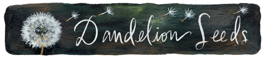
Email Banners are graphics which can add a tone to your posts and improve recognition of your Substack. Here are some great ones and for more examples, see:
Headers: the most overlooked real estate on Substack.


Thank you. I especially appreciate the reminder to use alt text.
Thanks Joyce - for some reminders AND new ideas.